On the Design of Poetry Textbooks

Professor Jennifer Roberts of Harvard University makes her art history students sit for three hours in front of a single work (like John Singleton Copley’s A Boy with a Flying Squirrel, 1765, pictured above). Read her brilliant essay ‘The Power of Patience’ on this idea here. She wants to focus
on creating opportunities for students to engage in deceleration, patience, and immersive attention. I would argue that these are the kind of practices that now most need to be actively engineered by faculty, because they simply are no longer available “in nature,” as it were. Every external pressure, social and technological, is pushing students in the other direction, toward immediacy, rapidity, and spontaneity—and against this other kind of opportunity. I want to give them the permission and the structures to slow down. The time span is explicitly designed to seem excessive.
She also makes sure they look at the work in the right physical context:
Also crucial to the exercise is the museum or archive setting, which removes the student from his or her everyday surroundings and distractions.
And so to poetry, the most compact and intense literary form. It takes time and repeated re-readings to release its meanings, and we need deep attention to access these, the kind of noticing that Jennifer Roberts insists on for her third-level students. Of course, they are far more expert than the post-primary pupils I teach: they are at one of the world’s top universities and already have extensive knowledge of art history, which they specialise in studying, whereas school pupils need much more guidance and scaffolding. Nevertheless - and this is the topic of this post - I believe we need some equivalent to enable productive focus on the poems themselves since (in Ireland at least), the books that the poems are in, actually militate against attention and deep-thinking.
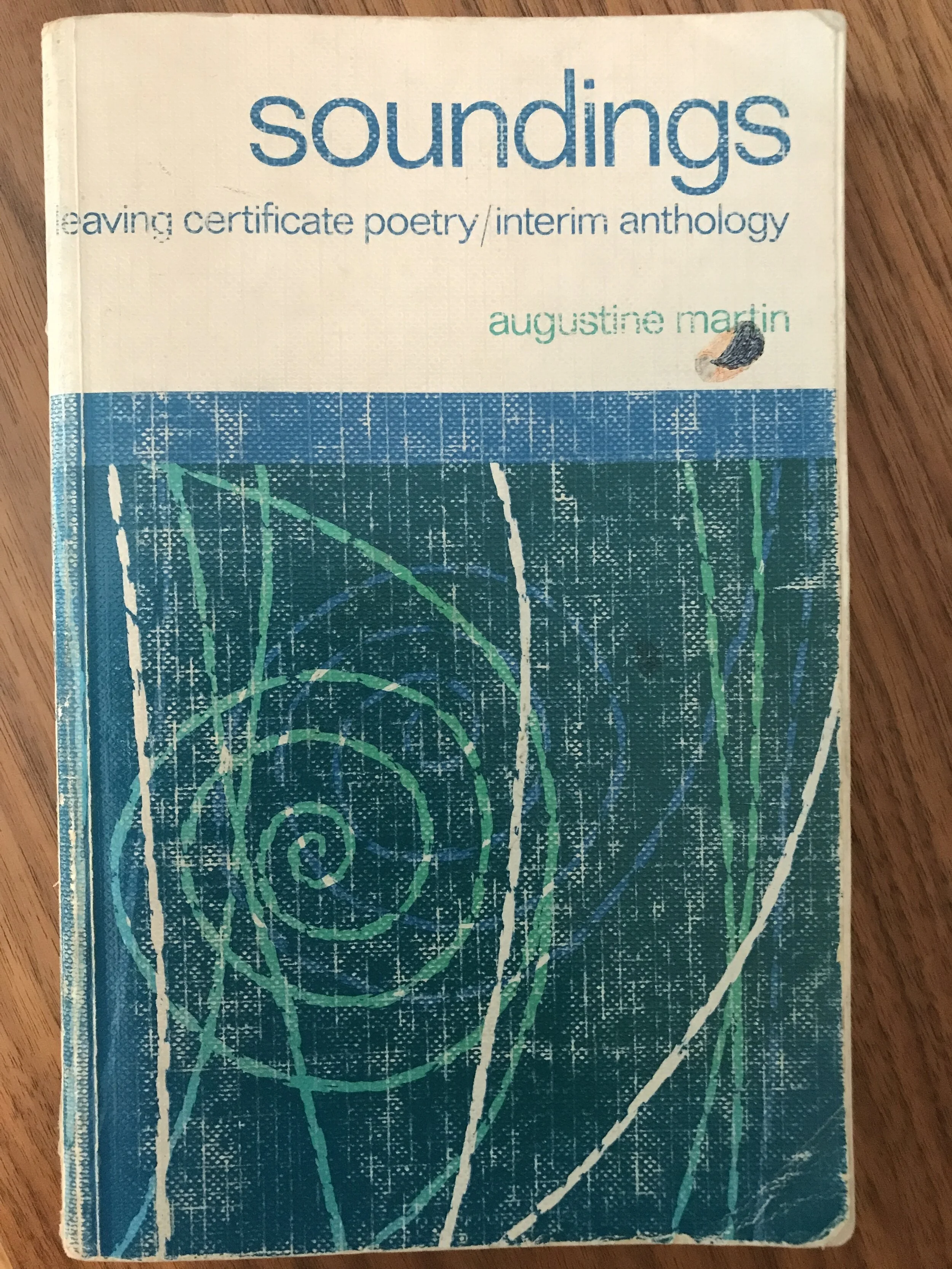
Let me compare two poetry textbooks for the Leaving Certificate that I have used. Firstly, there is the famous long-serving Soundings, (notoriously an ‘interim’ anthology for the Leaving Certificate) edited by Augustine Martin. First published in 1969, it lasted until the introduction of a new course in 2000. Secondly, an anthology for the course which concludes in 2023: in this case, I’ve imagined a book put together from the options on the market, which all broadly share the same design approach, and have called it Contemporary Anthology or CA (all the criticisms I make here are even more relevant to textbooks for younger pupils).
Soundings:
267 pages, small format.
97 poems.
0 illustrations.
395g weight.
Contemporary Anthology (CA):
600 pages+, large format.
96 Poems.
illustrations - too many to count.
1200g weight.
Before proceeding, I should say that this is not a piece on curriculum; the poems in both books are prescribed, and so publishers, editors and teachers have no freedom about that vital choice. Soundings was certainly of its time. The publishers had to follow the prescribed national curriculum, and there was a single female poet (Emily Dickinson) and a single living one (Thomas Kinsella). It was certainly not culturally or racially diverse.
Editors work within the design boundaries given by the publishers, and have little choice about the look of their books. And teachers can only choose between a small number of alternatives, all of which share similar approaches. It would be a brave publisher now who would send sales reps into schools with the kind of stripped-down textbooks I propose at the end of this piece.
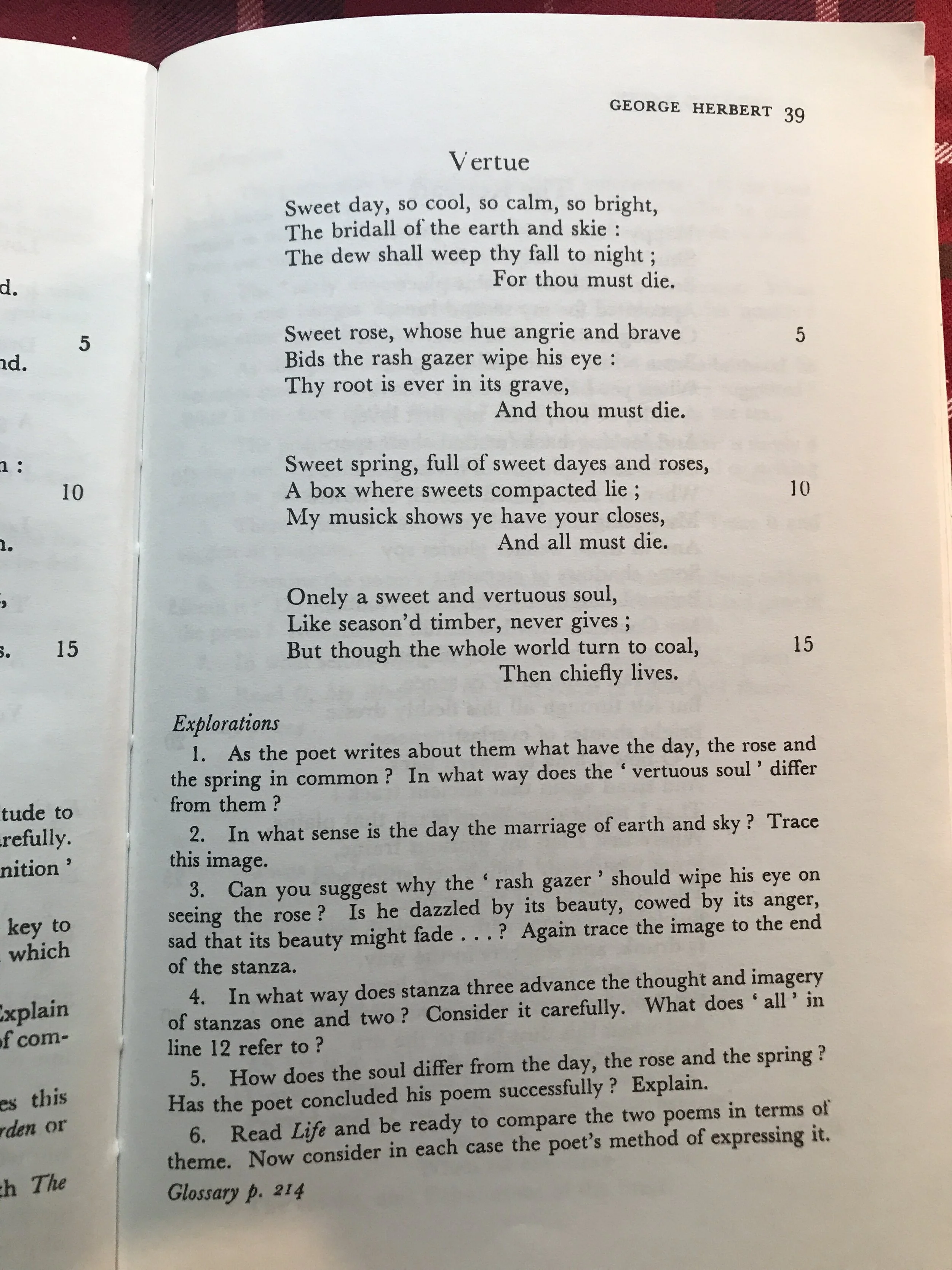
from Soundings
Contemporary textbooks have become enormously bloated: check out the weights above: CA is wrist-breakingly 3 times heavier than Soundings. That book presented its poems and the accompanying ‘Explorations’ mostly over one or two pages except for a few longer works like ‘Prufrock’, ‘Tintern Abbey’ and Paradise Lost, Book 1. The glossary was at the back of the book (signposted by page numbers). Soundings had just black and white text, determined by the printing and design costs of its time.
On the other hand, CA is a veritable blizzard of commentaries, questions, snapshot points, illustrations, guidelines, ‘before you read’ boxes, pull-quotations, audio icons, glossaries beside the poem, group-work suggestions. Colours are relentless: as headings, in text, as background to white text, as background to black text, in photographs. It is a cognitive and visual nightmare.
In CA illustrations are inserted just because they can be (Dickinson’s ‘A narrow Fellow in the Grass’ is accompanied by a picture of a snake: all wrong. Dickinson herself carefully avoided such explicitness in that poem, and the original publication in the Springfield Daily Republican wrongly gave it the title ‘The Snake’, also crassly normalising its punctuation).
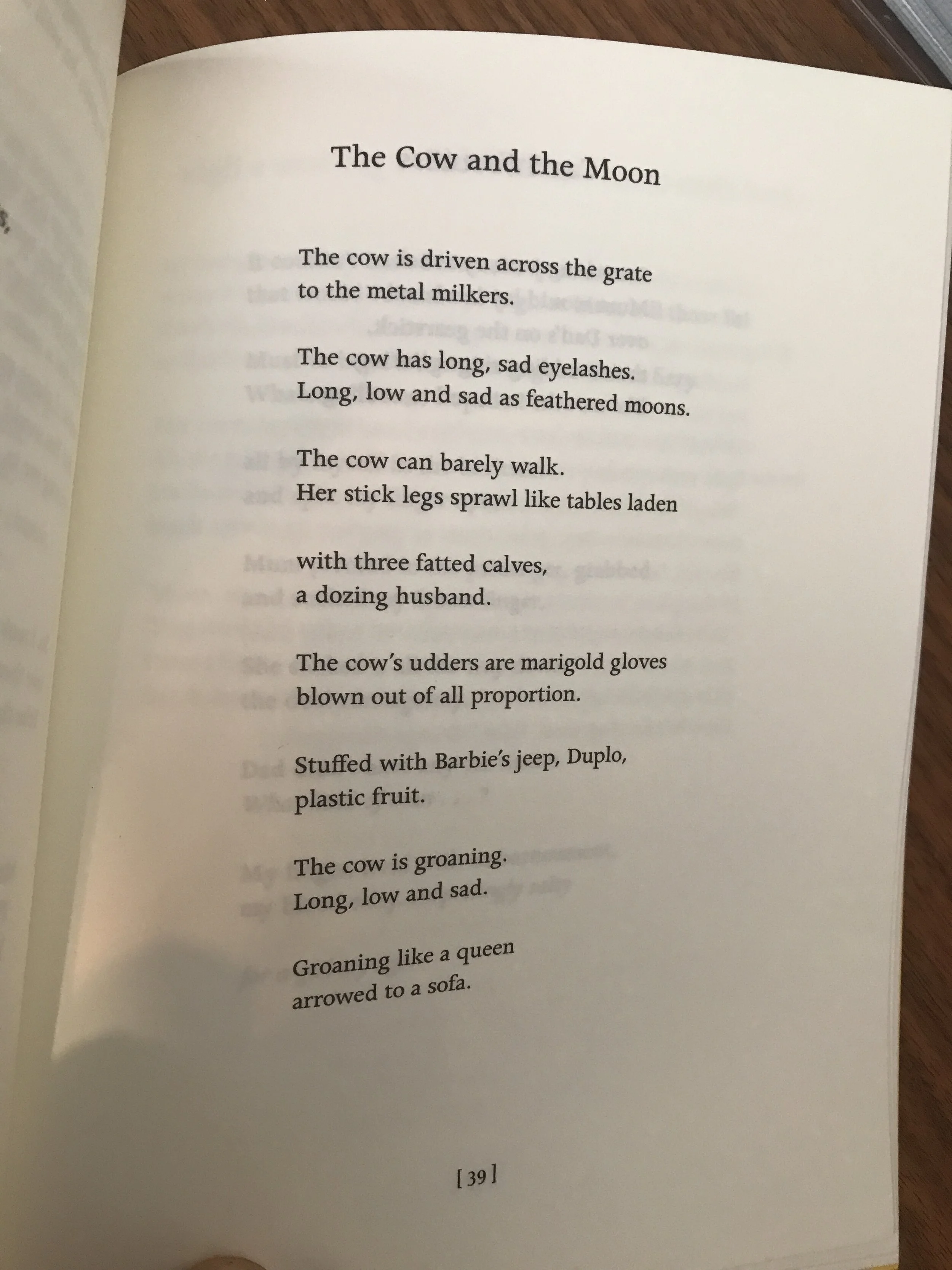
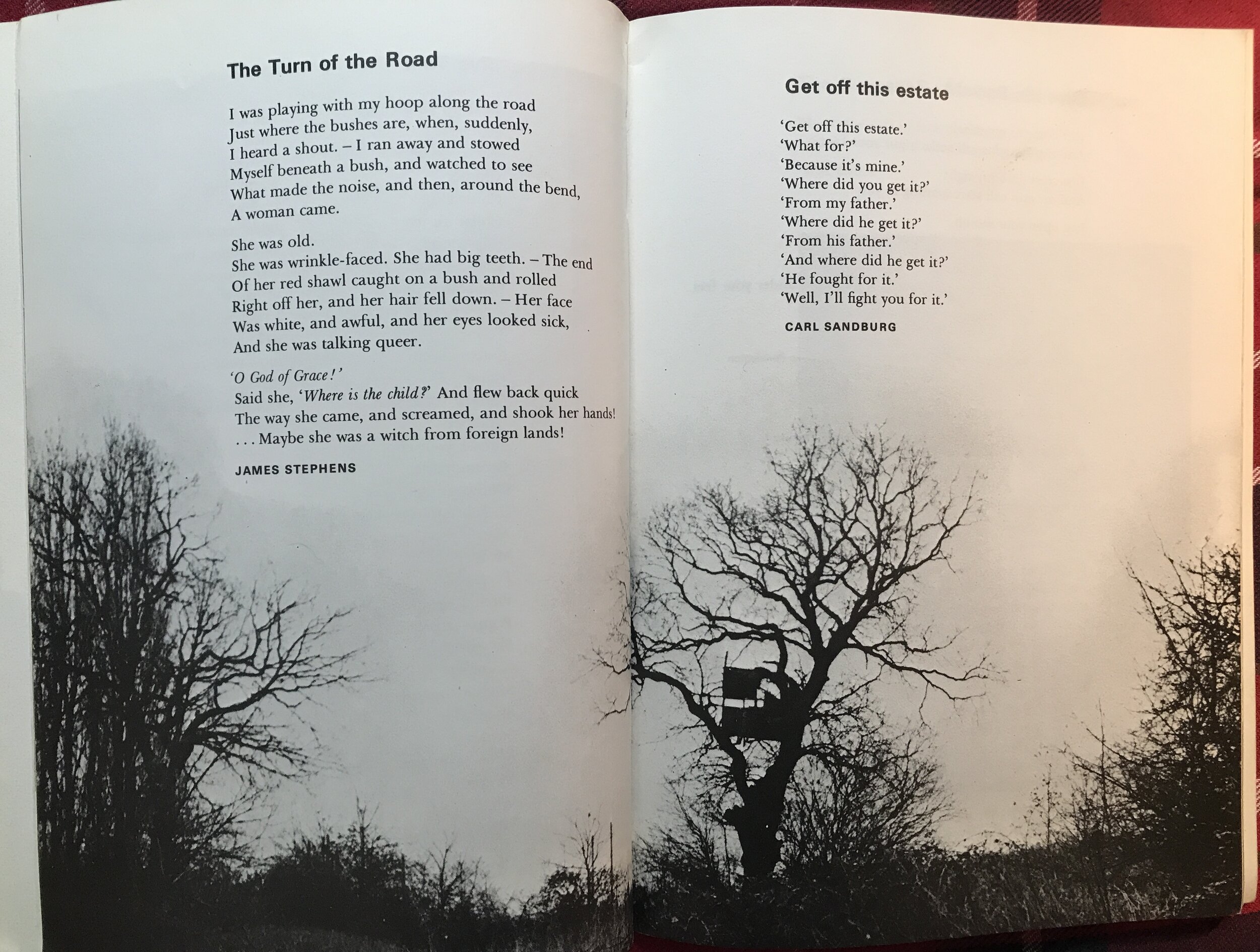
Poems need to breathe. They start in books (or magazines) standing in their own glory, such as ‘The Cow and the Moon’ from Rachel Long’s book My Darling from the Lions, and then in their migration to a textbook they become covered in explicatory barnacles.
It can be done better. Several decades ago Penguin Education produced a fine series of groundbreaking textbooks, mostly edited by Geoffrey Summerfield. Again they were of their time, now looking poor on gender representation, slightly better on racial and cultural diversity. But the design standards were top-class. An example was the Voices series, ‘an anthology of poetry and pictures’ for secondary level. Poems were presented confidently (no much so there were no notes at all), aligned consistently in plenty of white space. In the Teachers’ Handbook (1968, all 31 pages of it), Summerfield wrote about the illustrations:
These have been chosen as good in their own right, not merely as adjuncts to the poems, and not as illustrations of the poems.
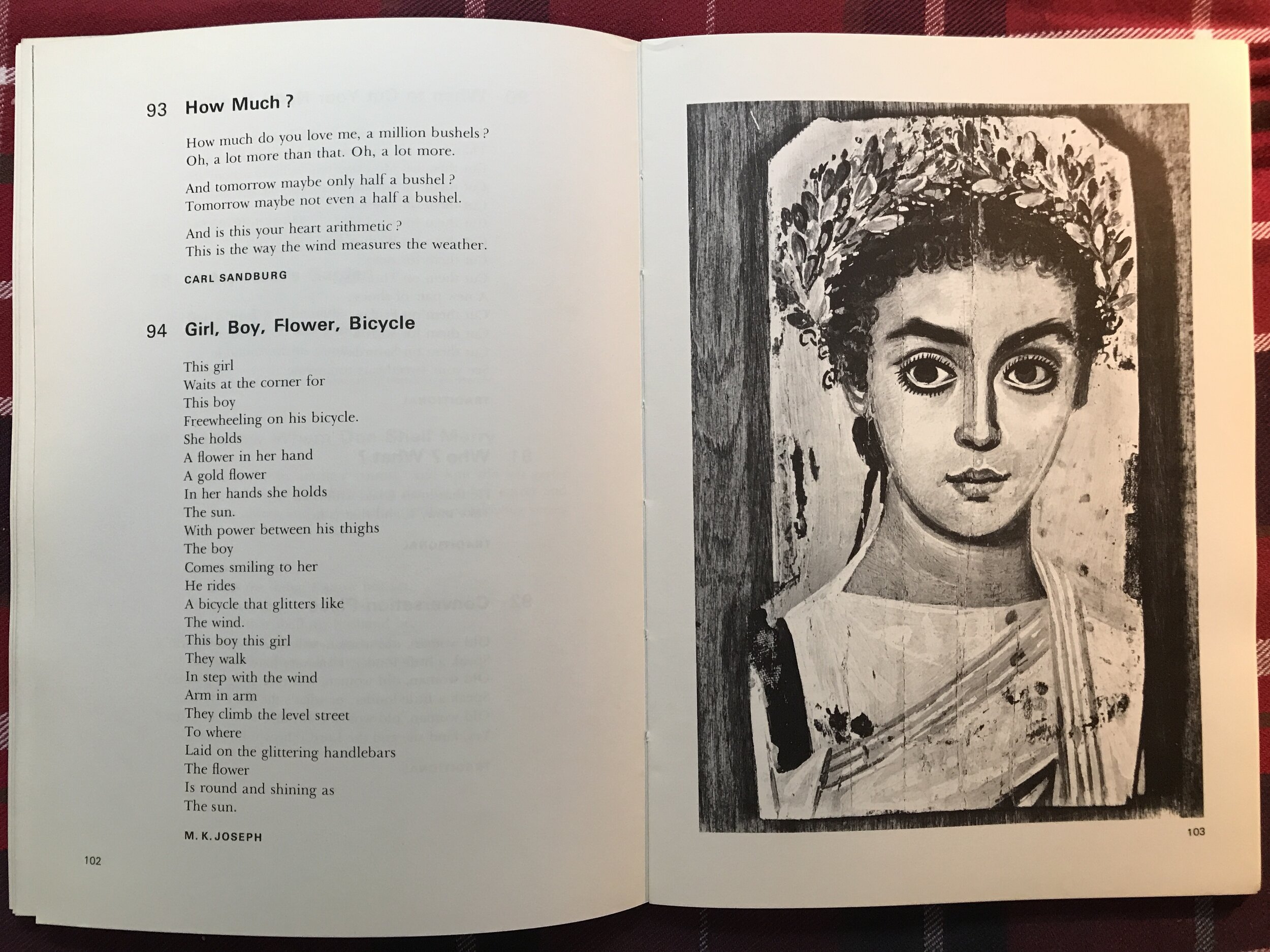
What is my ideal poetry textbook? Black text on white paper; a maximum of one poem per unencumbered page; lots of white space for writing notes; a bare-minimum glossary on a succeeding page to explain some references and vocabulary, with deeper context and biographies at the back of the book; a very limited colour palette (think of the beautiful, disciplined and restrained work of Oliver Caviglioli); photographs only when they directly enhance the poem (such as one of Kavanagh’s canal bank bench for ‘Lines written on a seat’ or a picture of a Greek urn for Keats’s Ode); sample answers, past questions and other resources outsourced to a website.
I don’t expect that book to be published anytime soon. Publishers are very unlikely to have the confidence to go to schools expecting them to put in orders. Teachers and pupils want ‘value for money’. Instead, poetry - that most compact and resonant form of literature - will continue to come to pupils throughout a distracting thicket of ‘stuff’ making it harder to encourage deceleration, patience, and immersive attention.